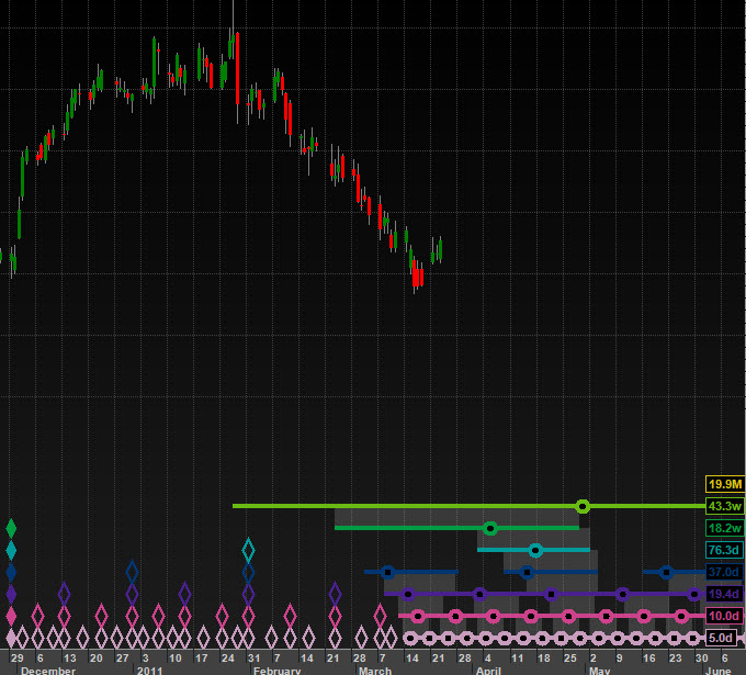
The long lines containing a circle at the end of a chart indicate where the next trough of a particular cycle is to be expected. The hollow circle is centred on the actual bar that is exactly one average wavelength from the last trough. The left edge of the line represents the shortest cycle of that nominal length found in the data and the right edge is the longest cycle found in the data (of that nominal length). So the next trough is expected somewhere on that line. The grey linking boxes that sit between the cycles represent which cycles should experience synchronized troughs.
If the software only has one cycle to work with there should be no whiskers, but that makes for very unrealistic projections with a variation of 0 bars (because it is unrealistic to expect a cycle to match the previous cycle exactly to the day). For that reason if the software has only one cycle to work with it assumes that the next cycle will be in the range of 65% - 150% of the nominal length because cycles can vary by that much.
For more information take a look round the Hurst Cycles Trading Academy. There is also more information to be found in the Online User Manual.
Sam Medwin
Comments